|
Kathy is so grateful that websites like WebAIM exist to help designers create high contrast, enabling them to design for people with colour vision deficiency. Here is a before and after shot of the dialogue text colours - the original colours mostly failed the Web Content Accessibility Guidelines, and the final colours passed, except for the Witch. We were very sad not to be able to use the murky green colour for the Witch outline, but if you use bright red then you basically have to go close to black to get enough contrast. Even though it is an apparent fail for the most stringent guidelines, they don't take luminosity into account, and in fact the text appears more boldly than for, say, Emma's colours, which pass. 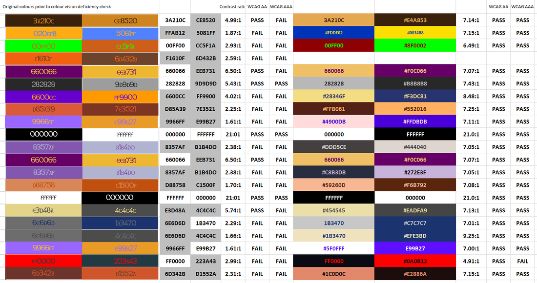 Sharp-eyed readers will note that one set of colours goes missing. Yes, we killed off a character. Alas, poor Harriet, I knew her well.
0 Comments
|
Joy Everafter Stories
Producer of Frog's Princess Archives
September 2024
Categories |
 RSS Feed