Players with vision impairment
Players with color vision impairment
Deaf players
Players with physical or motor disabilities
Players with cognitive challenges
Neurosensitive players
Players with color vision impairment
Deaf players
Players with physical or motor disabilities
Players with cognitive challenges
Neurosensitive players
Special instructions
The How To Play button in the About section of the game has different written and spoken versions. There is also a Vision Accessibility page on this website which explains how to play the game using a screen reader.
Action narration
We wrote and recorded 1,398 clips narrating what is happening on the page for players with vision impairment. This is costly in terms of game size. Unfortunately the narration had to be changed when page designs changed, so it was not recorded all at once in a studio with voice actors.
We only created matching text because we could, and we have found to our surprise that some fully sighted players use this feature, despite the fact that it slows down the game.
We only created matching text because we could, and we have found to our surprise that some fully sighted players use this feature, despite the fact that it slows down the game.
Voiced dialogue
All dialogue is voiced, including tutorial instructions.
Professional voice actors created each voice in a sound recording studio and all their dialogue is normalized.
Professional voice actors created each voice in a sound recording studio and all their dialogue is normalized.
Sound effects
We used hundreds of sound effects to illustrate the action.
- Single sound effects include a mud squelch, a sword being drawn, and a frog thumping a door.
- Looped sound effects include well water bubbling, hoof beats, and magic humming.
- Ongoing ambient sounds include forest sounds, carriage sounds, and the footwork and clashes of training soldiers.
Music
Some music conveys atmosphere, such as the Spooky Woods Theme and the Battle Theme.
Some music conveys character, such as the delicate yearning Emma's Theme, the brash, impulsive Francis's Theme and 6 other character themes.
Some music is situational, such as the National Anthem of Kassel, sung by diners led by by Hilda singing loudly out of tune, and 3 other songs.
Some music conveys character, such as the delicate yearning Emma's Theme, the brash, impulsive Francis's Theme and 6 other character themes.
Some music is situational, such as the National Anthem of Kassel, sung by diners led by by Hilda singing loudly out of tune, and 3 other songs.
Screen reader
We used the Unity Accessibility Plugin by Michelle “Mikrima” Martin of Metalpop Games to allow players to access the screen readers on their devices. We paid $75 per seat to use the plugin but it is now supplied for free, which is excellent for everyone making games in Unity. The code is beautifully designed and works across Android, Apple and Windows, which is an amazing feat. It even comes with a page of best practices. So this is our first confession – we have not fully implemented these guidelines. For example, we didn’t support the scrub gesture. However the good news is that we created 44 UI groups to ensure that most UI is accessible to blind players.
Number of UI groups 44
Number of toggles 9
Number of buttons 118
Number of labels 162
Number of text edit fields 2
Number of sliders 3
General accessibility advice is that developers should aim to make apps available for use in the same way to a completely blind user as it is to a sighted user. However there are two parts of the game which we did not make available.
1. Players using the screen reader do not get access to the Mirror feature, which is the character customization of the prince and princess, as it is visual only.
2. Players using the screen reader can't access the buttons which turn text on and off or change the spelling.
WORKAROUND: the screen reader can be toggled inside the game so players can access these features if they want.
There are a few glitches in the screen reader. For example, the only way to exit Contents is to choose a page. Once you change the page there is no way of knowing which page you were on. Also the Android screen reader doesn’t read out text fields (the workaround being that these pages are available on the website) and the iPad screen reader does not read out the Marketing page or the Extras page, which looks like a design fault, not a plugin fault, and is on our to-do list for an update.
The thing we worry about most is players who turn on the screen reader and then can’t turn it off again. We have explained how to do this in the How To Play guidelines in the game and on this website, but it really upsets these players.
No resizable text
Players cannot change the size of the text. If it is any consolation, our text is 48px at 1080p so it suits more players than the tiny text in many AAA games.
Text
We made a design decision not to have a panel behind the text, so it would have a more diagetic feel.
This meant the text had to have a font outlined in a contrasting color, so that it would show up against any background. We originally chose text representing each character, so the player would recognize it immediately as pertaining to that character. Unfortunately this did not provide enough contrast for players with color vision deficiency so we chose extremely light and dark colors on the same spectra.
There is no button for high contrast but we made sure that all text has a minimum contrast ratio of 7, excepting the witch text, which has a minimum contrast ratio of 4.91:1 but high luminosity.
Images
Although we didn’t plan it for users with color vision impairment, our characters contrast well with the background because they are 2D vector images with smooth edges rendered in flat colors while the background was created using 3D models and has rougher, more painterly textures.
Subtitles for narration
Subtitles exactly match the spoken words.
As mentioned earlier, our text is 48px at 1080p, just above the minimum website requirement of 46px at 1080p.
As mentioned earlier, our text is 48px at 1080p, just above the minimum website requirement of 46px at 1080p.
Subtitles for sound effects
Every sound effect has a matching subtitle, with <carats> around it to distinguish it from the narrative text.
Some callouts are treated as sound effects e.g. <Emma gasps>.
There are some ambient sounds which play in the music channel and these are generally described on the first page they play, e.g. <diners murmur>, and not on succeeding pages. Players jumping around in the Contents may miss these descriptions.
Visual cues
The game includes visual effects such as magical glows and witch lightning, but this is for illustrative purposes, not specifically for deaf players.
Music
We are vexed that we did not have the capacity to create a feature which showed deaf players what theme music is playing. We could have done that with an oscilloscope effect overlaid with different colours for the different themes.
Separate volume controls
We created separate volume controls for music, sound effects, and dialogue.
Ongoing sound effects which are carried forward to new pages are in the music channel.
Ongoing sound effects which are carried forward to new pages are in the music channel.
One of our earliest testers was a wheelchair user and contributed significantly to the UI design.
Things which could be improved
- Play and Back buttons are next to each other and on the bottom, so they are easy to reach.
- Buttons have many alternates.
- Mouse use is optional.
- Large clickable actions do not demand precision.
- The game does not require long presses.
- There are no time-out windows.
Things which could be improved
- There is one place where the game requires typing, which is when you name a new book. One letter will suffice.
- There is one type of interaction where scrolling is needed, which is when the player is reading a text field being the How To Play, Privacy, and Terms of Use pages.
- The game is not fully mapped to controllers. However once you get going you can sit back and press Play and Back on the controller.
- Buttons cannot be remapped.
During our exhibitions we were amazed to find that 5 and 6-year-old boys consistently become fascinated by the game. It seems to serve as a bridge between videos and reading for children who have not yet become comfortable reading.
Things we did for cognitive accessibility:
• How To Play instructions in game, and even more detailed How To Play instructions on this website with pictures with arrows
• Tutorial scenes
• Everything stops until the player is ready to move forward
• Few choices, one task at a time, and player sees results immediately
• Back button to redress impulsive actions
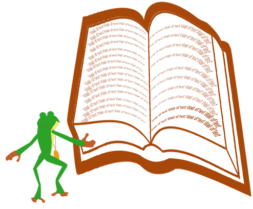
• No walls of text
• Contents buttons with pictures giving a good overview of the storybook
• Book opens where the player left off
• Contents frames show where players have been
• Visual clues such as frames around Contents buttons, and glows on UI buttons when they are mentioned in the tutorial
Things we did not do for cognitive accessibility:
• We did not put tool tips on buttons. This was a deliberate design decision because the buttons are simple and the game is long. Tool tips only serve to take players out of the story.
• Another thing we did not do was simplify the language. Dialogue is archaic and older characters use stilted language. We find that even players with low-level English skills have no trouble following what is happening in the story.
Epilepsy
Frog's Princess passes the Harding’s test but it does have flashing lights in places and there is no absolutely safe minimum for people who are photosensitive.
Motion sickness
When you open the Contents, page buttons rush past.
WORKAROUND: Grab a page button to move the page buttons manually.
There is a warning in the store description and the Parents page about this.
WORKAROUND: Grab a page button to move the page buttons manually.
There is a warning in the store description and the Parents page about this.


